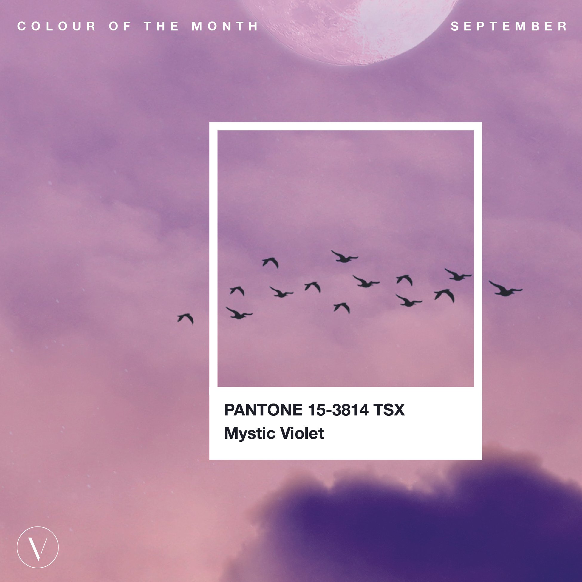
Olive Branch | Visuable Colour of the Month for November
Your Monthly Source of Brand Inspiration from the Visuable Creative Team
Olive Branch is a medium-dark shade of yellow-green.
Using this colour in your brand identity design will give it an organic, iconic, and soulful feel that demonstrates the contrast between strength and softness.
In general, the colour green reflects a fresh start, nature, positivity, and sustainability.
In this case, this versatile, mid-tone green, goes a little bit beyond by speaking towards the symbol of humanity, hope, vitality, and peace.
In the website designs, Olive Branch's organic roots provide a feeling of purpose. The complexity of its colour is reliable, quietly robust, and dependable, while its softness offers a sense of grounding calmness.
P.S. Do you struggle to find the right words when writing content for your business?
QuillBot helps people by improving their writing and research skills. It uses cutting-edge AI to provide people with instant feedback, allowing them to improve continuously.
You can use Quillbot as:
A Paraphraser to refine, enhance, or simply reword your written work.
Grammar Checker to polish your work by addressing punctuation, spelling, and word misuse.
or to summarize news, articles, long emails, or even your own writing.
Click here to explore Quillbot!


